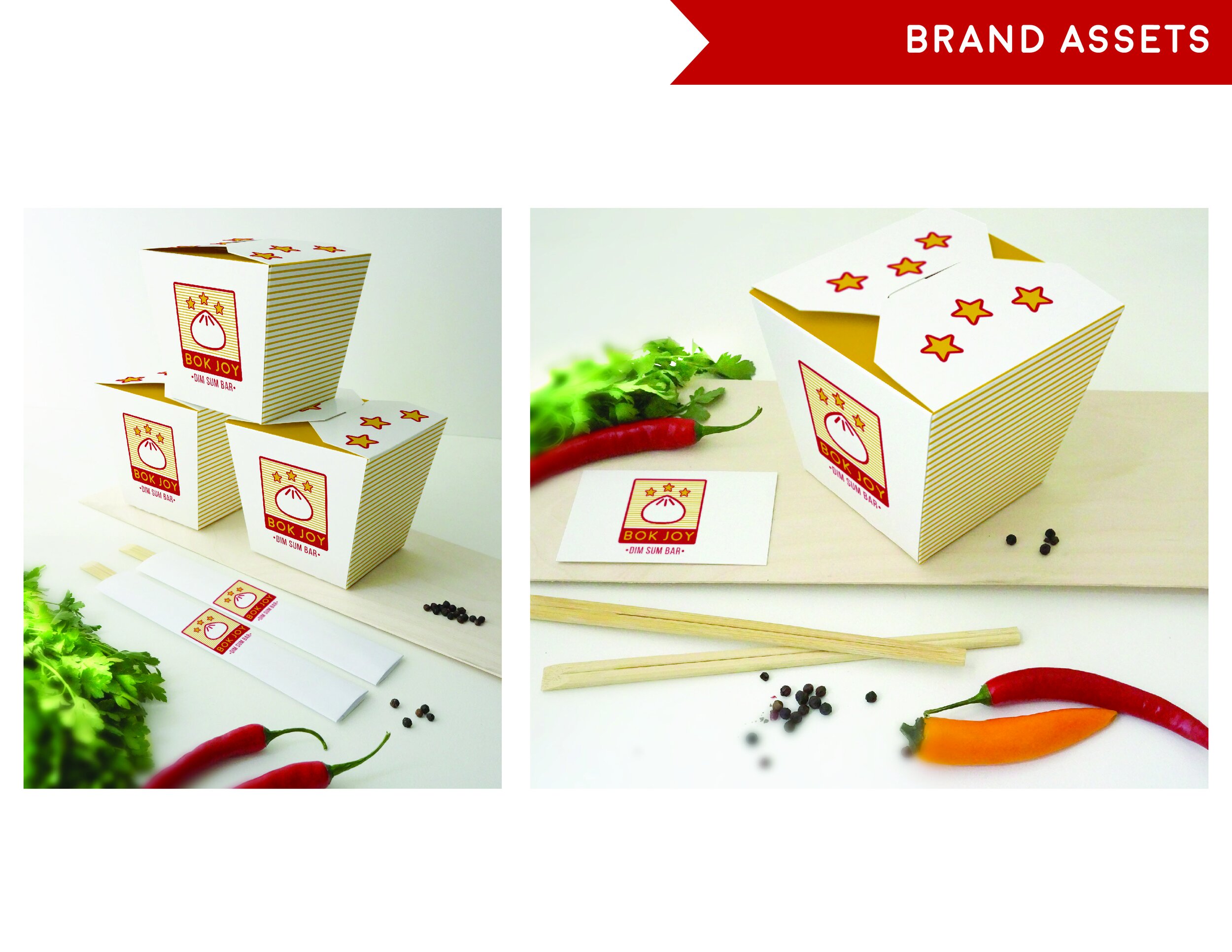
I created a branding package for "Bok Joy," a casual dim sum restaurant named after the Chinese cabbage "Bok Choy." Inspired by Hong Kong's neon-lit nights, I incorporated strong lines and vibrant colors into the design.
The modern logo features a monoline dumpling icon, ample breathing room, and clean, sans-serif fonts. The overall feel is light, bright, and joyous. Red and gold (yellow) were chosen for their symbolic significance in Chinese culture and their ability to stimulate hunger and appetite in color psychology.
Bok Joy Branding